• Project Type: Master's thesis project in collaboration with Svalna AB
• Role: UX Designer
• Challenge: Design a set of features for a carbon calculator app that makes reducing emissions fun and competitive, while ensuring it’s simple and motivating for users.
• Solution: A carbon calculator app with gamified challenges and a leaderboard that encourages users to engage with the app while learning about sustainability.
• Key Decisions: Focused on reducing complexity and visualizing progress to create an accessible and engaging user experience.
• Testing Insights: Users wanted a simpler way to understand carbon emissions and preferred a non-judgmental, anonymized leaderboard.
• Deliverables: High-fidelity prototypes and design guidelines.
Background and Challenge
This project was a master’s thesis in collaboration with Svalna AB, a research based company in Gothenburg. The goal was to improve their existing app by incorporating features that would engage users in a competition to reduce their carbon emissions. The challenge was to design a user-friendly, motivational feature that could make carbon reduction both fun and easy for users to engage with.
Research
We began by investigating nudging, gamification, and pro-environmental behaviour to understand how these techniques could encourage users to take climate action. We also conducted benchmarking on other carbon apps like Earth Hero and Deedster, as well as competition-based apps like Step Bet.
Research Methods:
•Questionnaire: Aimed at gathering insights into people’s awareness of carbon footprints, their experience with calculators, and their motivations to participate in challenges.
•Interviews: 10 semi-structured interviews (6 experts, 4 users with experience in climate competitions) to gain deeper insights into user behaviour and challenges.
•Literature review: Focused on user motivation, game mechanics, and sustainable behaviours.
Key Research Insights:
• Fear of judgment: Users expressed concern about being judged based on their emissions, which would discourage participation.
•Desire to share knowledge: Users wanted a platform that allowed them to share what they were learning about sustainability.
•Interest in sustainability: Participants were eager to engage with sustainable practices and learn more about how to reduce their emissions.
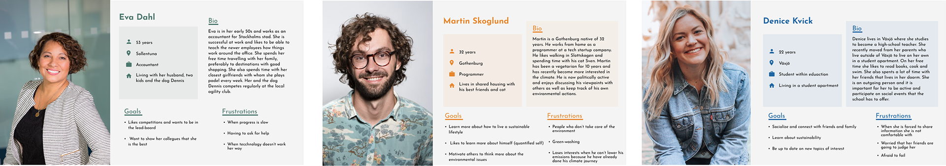
Three user personas.
Design Process & Decisions
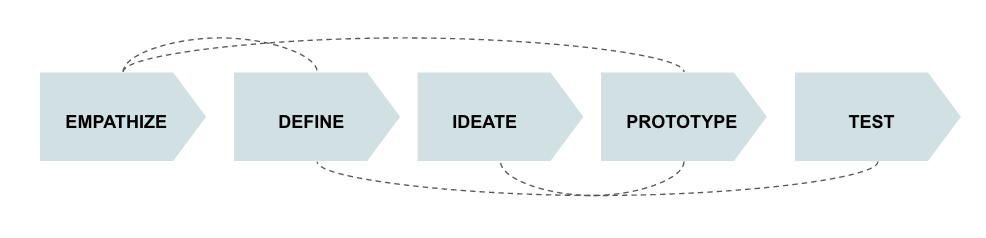
The design process followed Design Thinking and included six iterations. The primary focus was on creating an experience that felt engaging and accessible while promoting education and motivation.
Key Design Decisions:
Leaderboard redesign: Initially, the app displayed the leaderboard with a ranking of all participants. We simplified this by only showing the top three players, with users also being able to view their own rank in a non-public manner. This approach was based on research findings that users didn’t want to be judged.
Challenge-based learning: To make the app more interactive, we integrated challenges that encouraged users to reduce their carbon emissions. Users could also click on team members or individuals in the leaderboard to see which challenges they had completed, promoting learning through shared experiences.
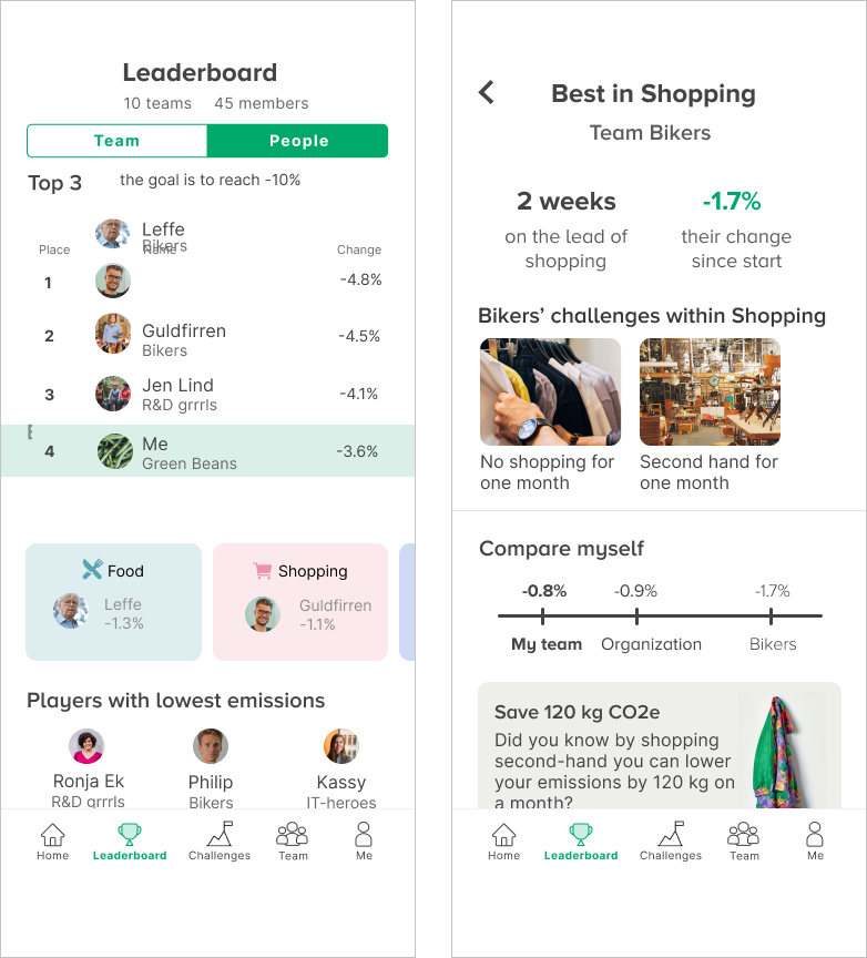
Visualising emissions: We focused on simplifying the CO2 data to make it easier for users to understand their impact. Using visual progress indicators and breaking down the emissions into different categories (Food, Transport, Household, and Shopping) helped users track their progress and understand where they could improve.
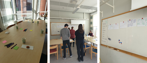
Design workshop.

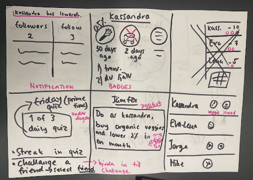
Selection of sketches from the initial sketching sessions.
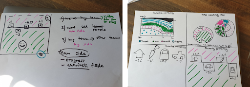
Sketching on how to visualise a decrease in CO2 as something positive.

Low-fidelity prototype of challenges.
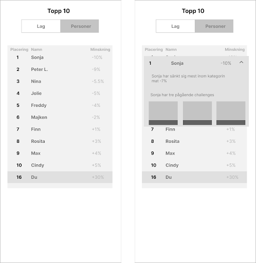
Low-fidelity prototype of leaderboard.
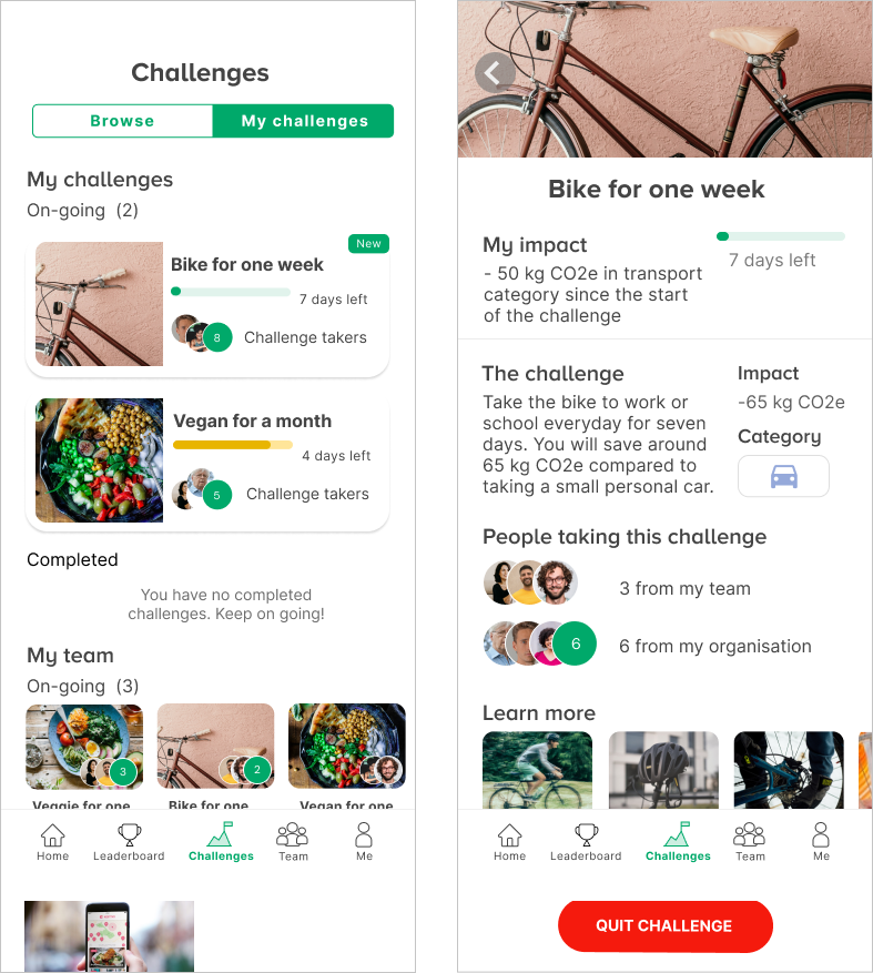
Hi-fidelity prototype of challenges.
Hi-fidelity prototype of leaderboard.
Testing & Feedback
Throughout the project, we conducted formative testing using think-aloud methodology. This involved testing low- and high-fidelity prototypes to gather feedback on usability and design.
Key Insights from Testing:
•Simplicity is key: Many users found CO2 emissions to be difficult to understand, so simplifying the data and using visual cues like progress bars was essential.
•Leaderboard preferences: Users appreciated the anonymised leaderboard as it reduced the fear of judgment while still allowing them to track their progress.
•Learning through others: The feature that allowed users to click on others’ profiles to learn about their challenges was well-received and motivated users to take part in more activities.
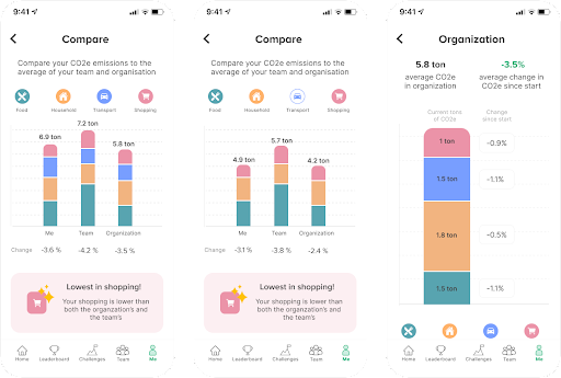
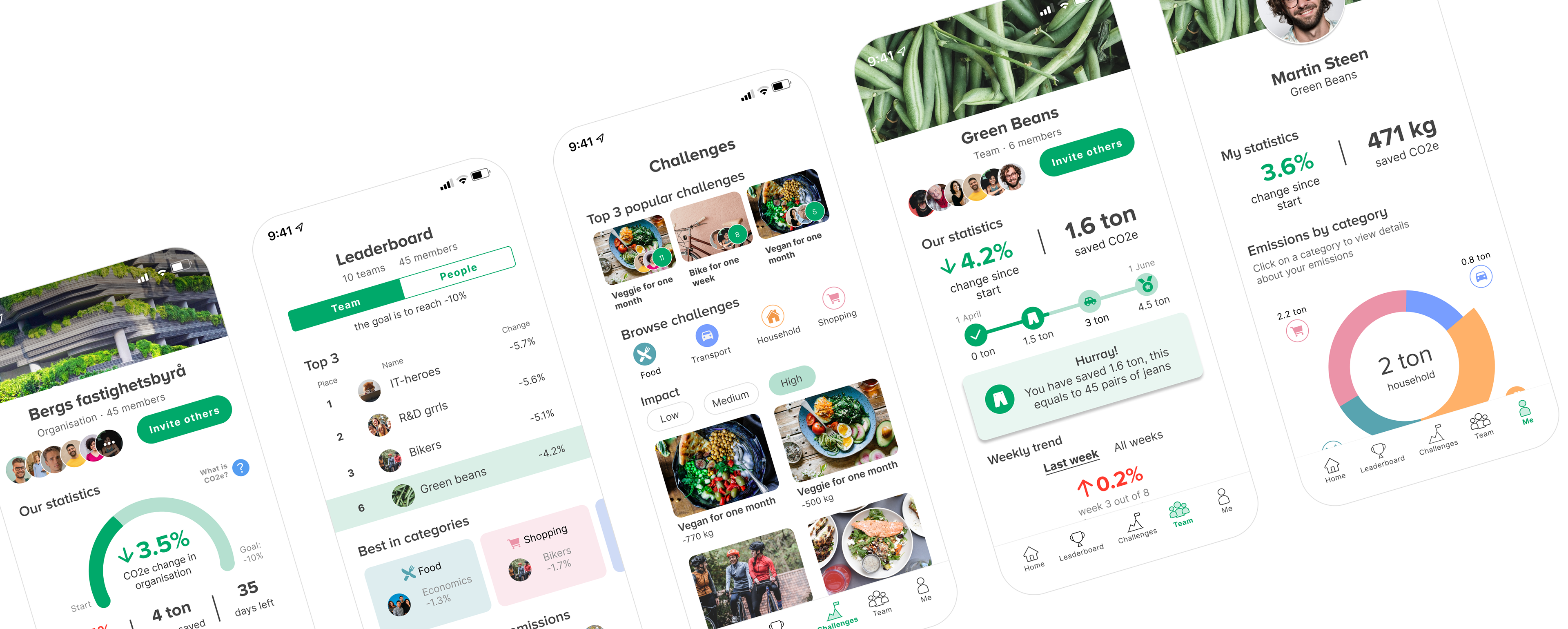
Visualising a user's CO2 emissions in comparison to that of the organisation and the team.
Outcome and Learnings
The final design, called Kallna (which means "to cool down" in Swedish), featured five main screens:
1. Home: Overview of the user’s emissions progress.
2. Team: Emission progress for teams.
3. Me: Personal emissions data and progress comparison with the team and organization.
4. Leaderboard: An anonymised leaderboard showing only the top three participants and the user’s own rank.
5. Challenges: A section where users could participate in challenges to reduce emissions.
Key Features:
•Visual Progress Indicators: Easy-to-understand progress bars showing how much CO2 has been saved.
•Leaderboard: Simplified to only show the top three participants with a comparison to the user’s own progress.
•Educational Component: Users could view challenges completed by others and learn from their actions.
Next Steps & Learnings:
Although the project was not able to explore the long-term engagement of users over time, we concluded that the app succeeded in making carbon reduction feel interactive and educational. Future work could focus on expanding the challenge features, creating more educational content, and improving the CO2 visualisation to make it even more user-friendly.
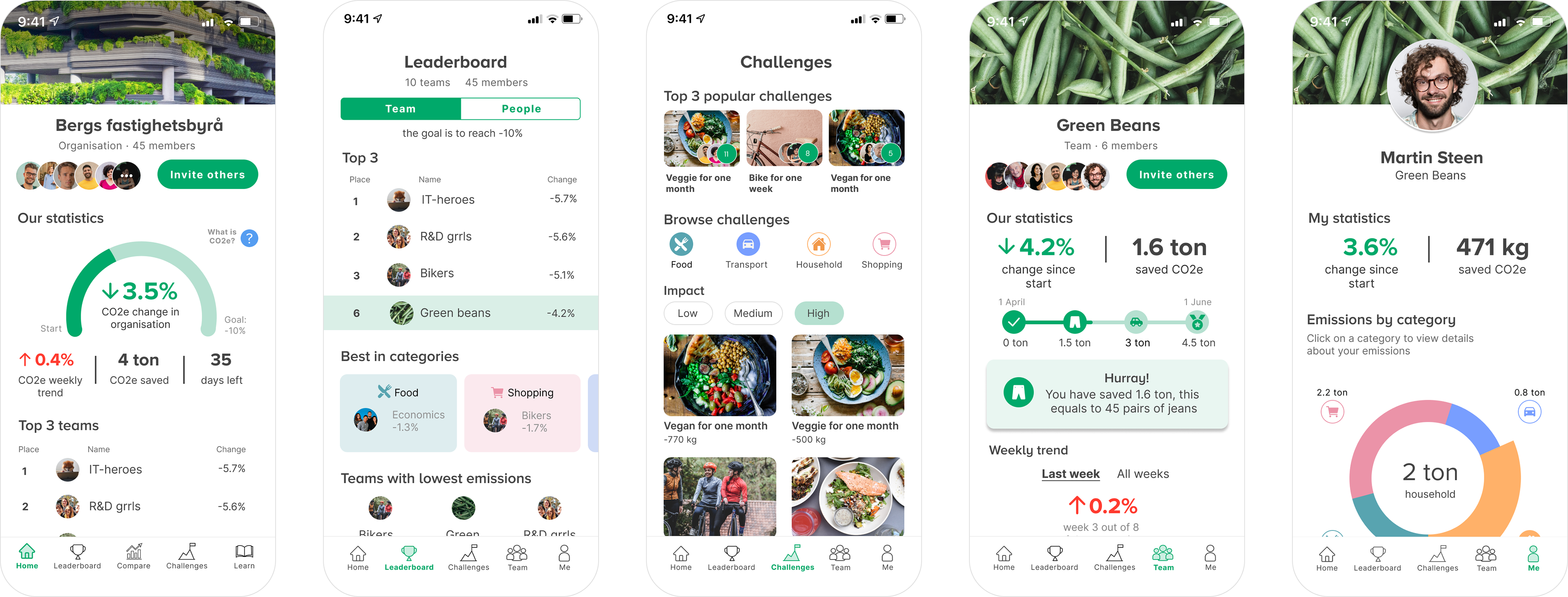
Five main screens from the final design.